Aerosync:
Earned Trust
Designing Aeropay's embeddable bank-linking widget for pay-by-bank onboarding, with a focus on trust, client customization, and conversion.
What does it take to make a financial product feel trustworthy the first time someone uses it?
Bank linking sits at a very sensitive point in the payment experience. It's the moment when a user decides whether they trust a product enough to connect their financial institution. If the experience feels clear, secure, and familiar, they keep going. If it feels even slightly off, they leave often for good.
I joined Aerosync team when the product had a working core, but still had a bigger question to answer: what did this product need to become? Over three years, I owned the design end-to-end as the sole designer. I redesigned flows, filled in missing product pieces, ran research, rewrote copy, built out error handling, and eventually helped reshape Aerosync into a standalone product that clients could purchase on its own.
A strong technical foundation, but large parts of the experience hadn't been designed at all.
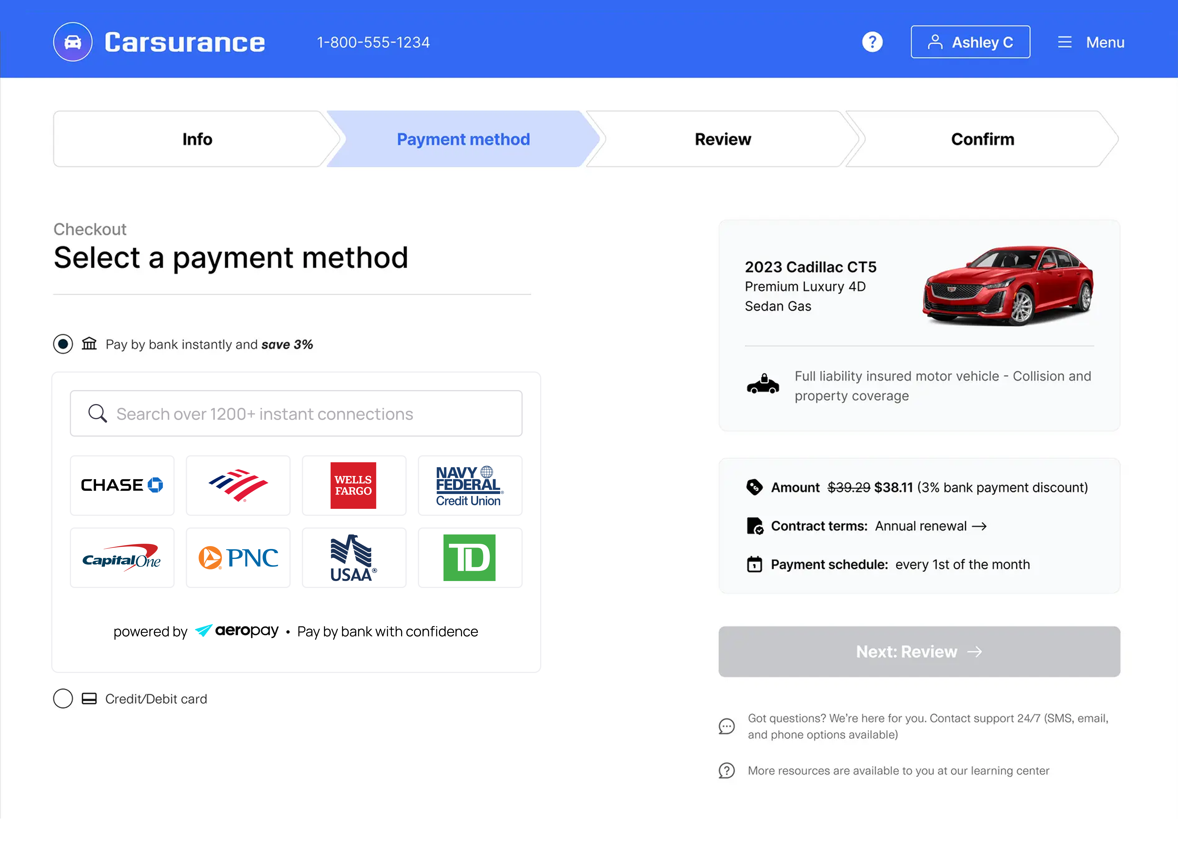
Aeropay is a pay-by-bank network, a direct alternative to card payments that lets users transact directly from their bank account. For that to work, users need to link their bank first. That's Aerosync's job, and because bank linking happens before the payment, it carries everything.
Before building Aerosync, Aeropay relied on third-party aggregators. None of them could be customized meaningfully enough to feel native to a partner's product or give Aeropay real control over the experience at the moment it mattered most. So Aeropay built their own: Aerosync. It was built to address limitations around data reliability, conversion during onboarding, and brand flexibility/white-labeling.
The technical foundation was strong, but the product was still young. The team was small: one PM, one designer, and a few engineers splitting backend and frontend work. Aeropay was also in motion, expanding into new verticals, rethinking its brand, and finding its footing as something bigger than it had been. Large parts of the Aerosync experience, including manual linking, error handling, customization for clients were either unfinished or hadn't been designed at all.
Three years, three versions.
Each one solved the problem the last one revealed.
The coherence issue
In 2023, Aerosync had a working core, but the experience still needed definition.
- The interface felt fragmented. Components varied across flows, UI elements were heavily branded, and multiple data sources made those inconsistencies more visible as users moved through different linking paths.
- The product identity was also unclear. We paired the Aerosync name with the Aeropay plane mark, making it harder to tell whether this was Aeropay, Aerosync, a feature inside Aeropay, or a separate product. In a bank-linking flow, that ambiguity becomes a trust issue. Users connecting a financial institution need the experience to feel clear, stable, and intentional.
The first phase focused on cohesion. I cleaned up the UI, standardized patterns, clarified the flow, and designed missing parts of the experience that had not been fully defined.
When branding got in the way
To address the UI inconsistencies, Aerosync was brought into Aeropay's design system, Aerodynamic, and the experience started to feel more mature. But this version also exposed a deeper product tension:
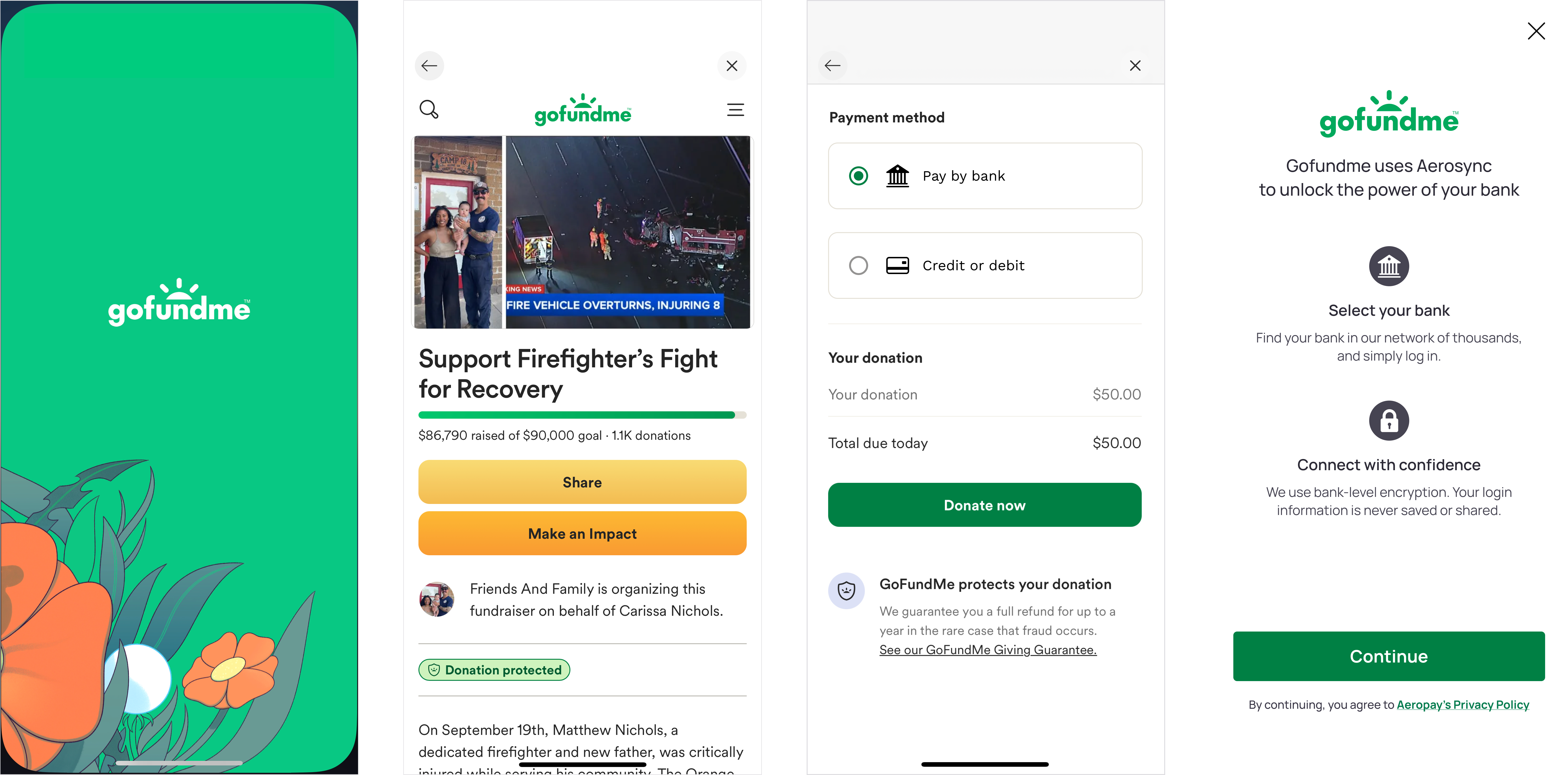
- Aerosync was becoming more important to Aeropay and was starting to be offered as a standalone product. In an effort to establish Aerosync as its own brand, the experience became heavily branded — a direction I was not aligned with. This direction began to conflict with client customization, making it harder for the flow to feel native within a client's product.
- Dark mode was introduced as a client request, not yet as a scalable system. We added it after signing a major client that needed it, but it was not yet fully supported by our design system. As a result, more inconsistencies started to appear. Aerosync needed to be polished enough to stand on its own, while flexible enough to disappear into a client's experience.
Customization as a trust mechanism
Around this time, research helped clarify why customization mattered. We ran A/B testing to understand how much the visual context of bank linking actually mattered to users. Users felt more secure when the bank-linking flow visually matched the product they came from. Even when they understood that a third-party tool was powering the connection, the experience felt safer when it still belonged to the same environment.
Users don't audit design consciously. They read environments intuitively and draw conclusions about trust from coherence, from whether things feel like they belong together.
That finding shaped the 2026 version of Aerosync: a white-labeled experience designed to flex across client brands while staying consistent, clear, and trustworthy.
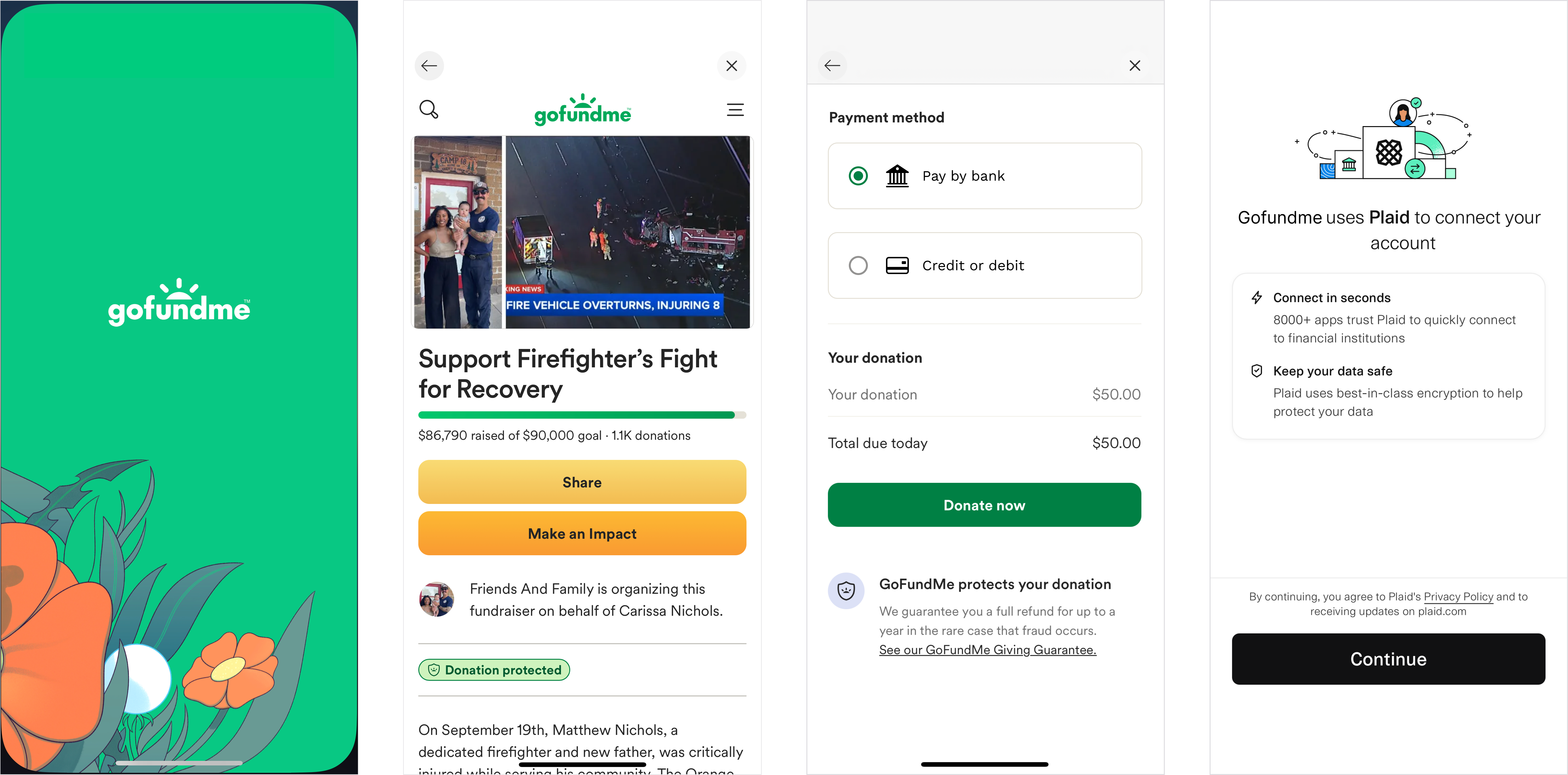
White label first.
The 2026 version gave the product a stronger foundation for that shift: a white-labeled experience that is flexible enough to support different client brands, configurations, and flows while staying consistent throughout. Across the redesigns, completion rates improved meaningfully. We reduced confusion, and created a more scalable foundation for future expansion.
From an incomplete internal tool to a revenue generating standalone product.
Aerosync today is a revenue-generating standalone product that clients can purchase independently. More than 1 million end users have connected through Aerosync.